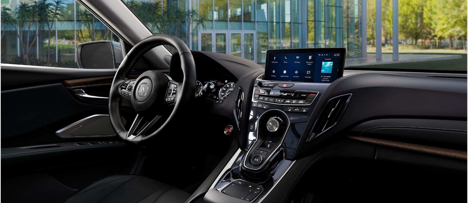
Turning Acura's biggest weakness into its strongest feature
An infotainment system falling behind the brand
Acura's in-car experience was dated and inconsistent across the lineup — a luxury badge attached to an interface that reviewers routinely called the weakest part of the car.
Our goal: a unified, touch-first system built from zero
Design an entire infotainment OS — over 1,000 screens on a brand-new Android-based platform — that felt unmistakably Acura and worked the first time a driver touched it.
Role & impact
Lead UI designer, partnered with Honda R&D engineers, stylists, concept-car specialists and researchers
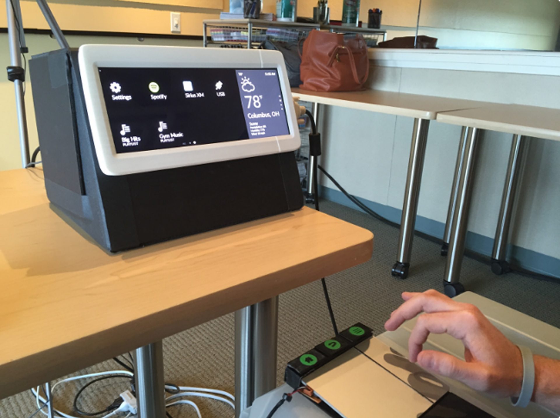
Created and ran usability studies with researchers and technologists
Built functional prototypes with in-house front-end developers
Supported UX on information architecture and user flows alongside Honda engineers
Delivered the launch UI specifications — still in use a decade later
Results: the interface stopped being the caveat
retail luxury SUV, and #3 luxury model overall (YTD June 2019)
straight months of sales growth, 11 of them record months (June 2019)
of Acura market share gained between 2016 and 2021
“Acura has finally made an easy-to-use infotainment system.”

“A major improvement over previous Acura systems.”

“One of the top 100 innovations of 2018.”

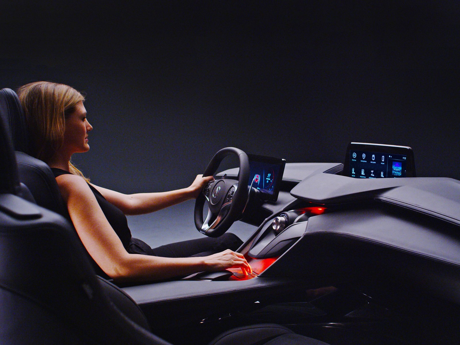
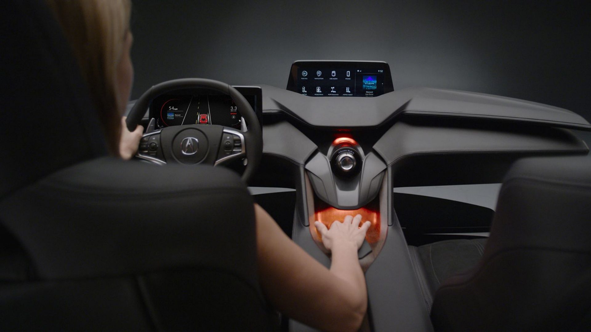
Conceptualization: defining what Acura should feel like
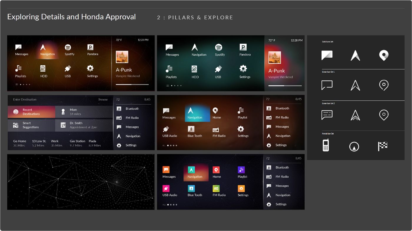
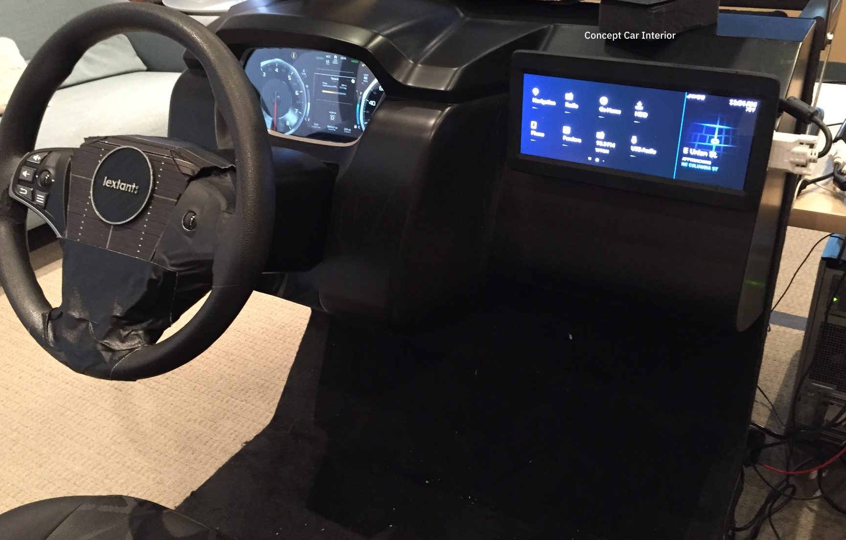
Working inside Honda R&D's concept-car division, we defined the information architecture and interaction model with engineering, then pressure-tested the visual motif against what the brand was — and wasn't.
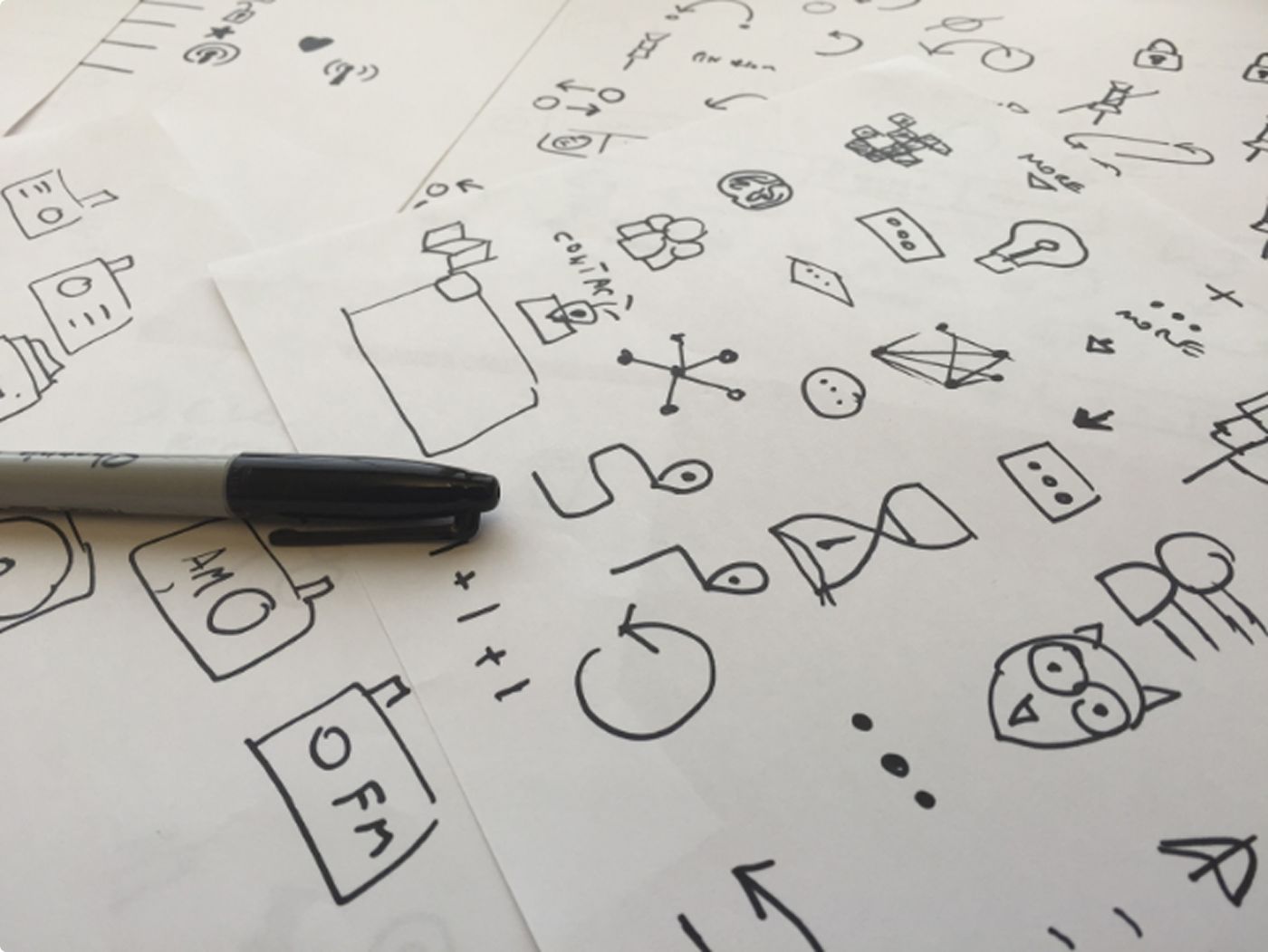
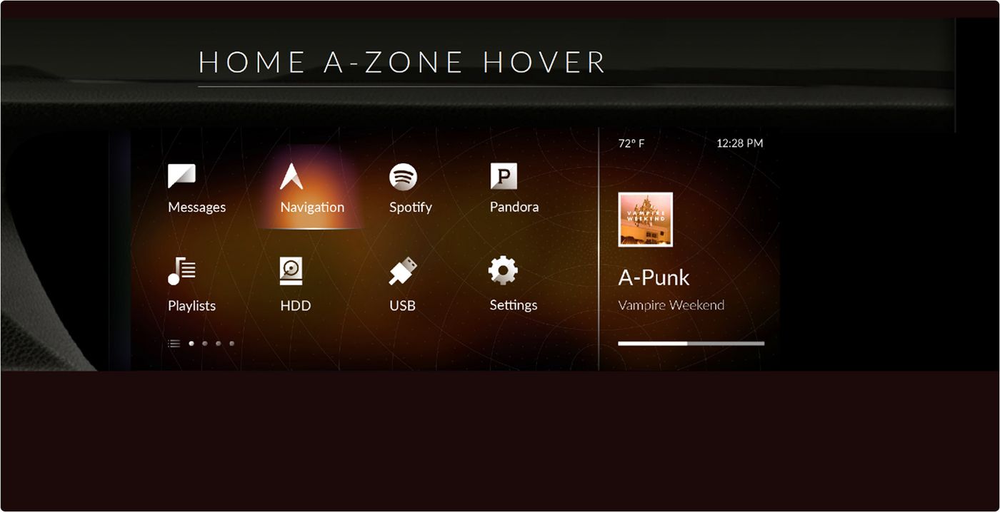
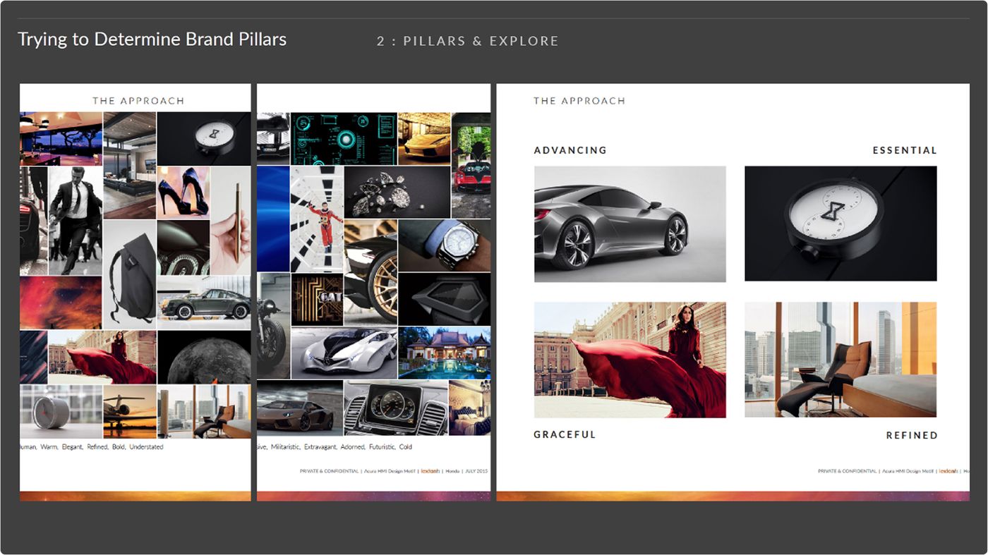
Refinement: from a hundred directions to one
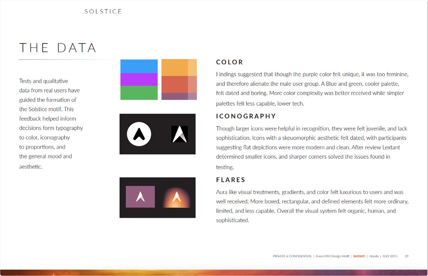
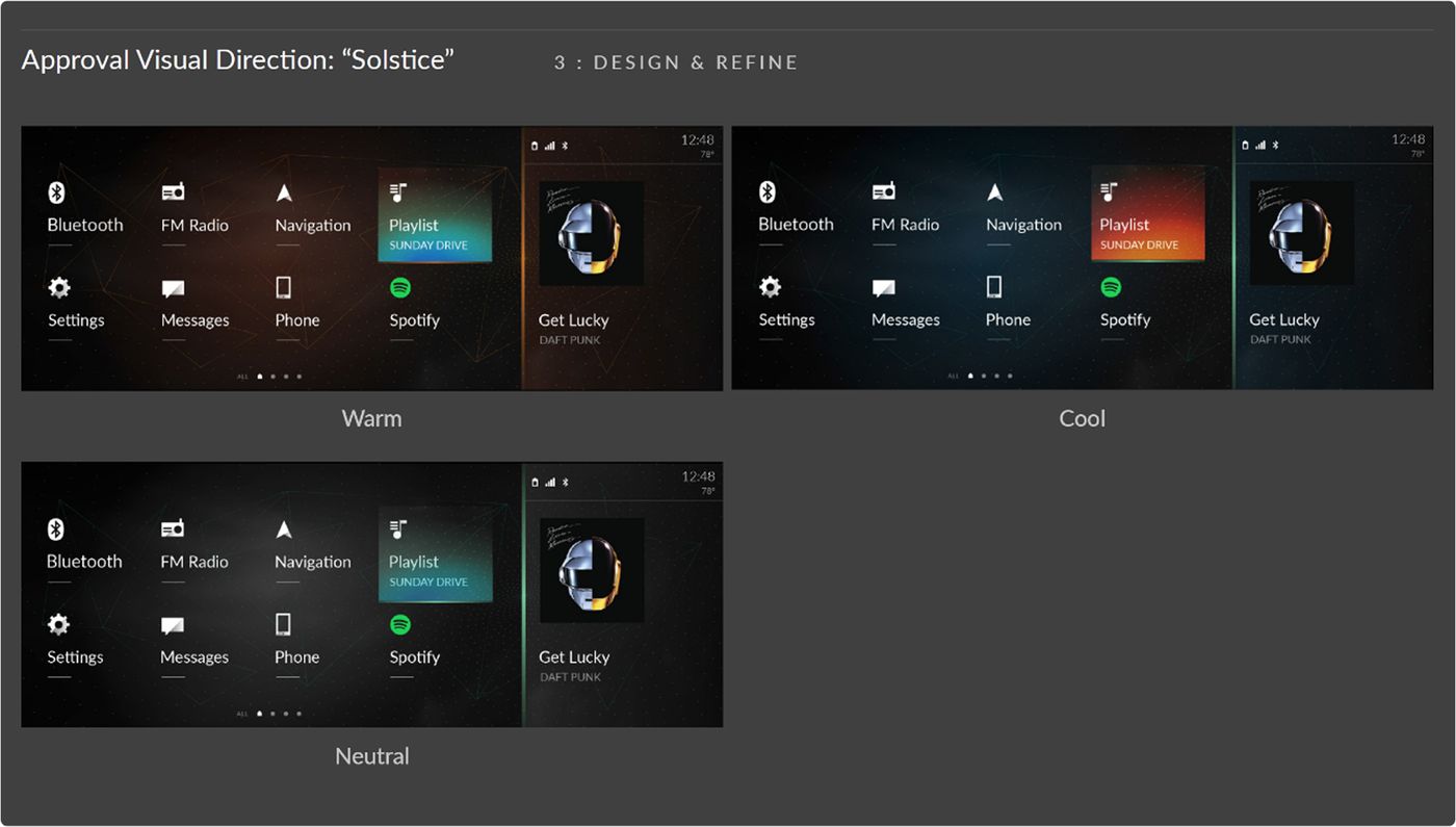
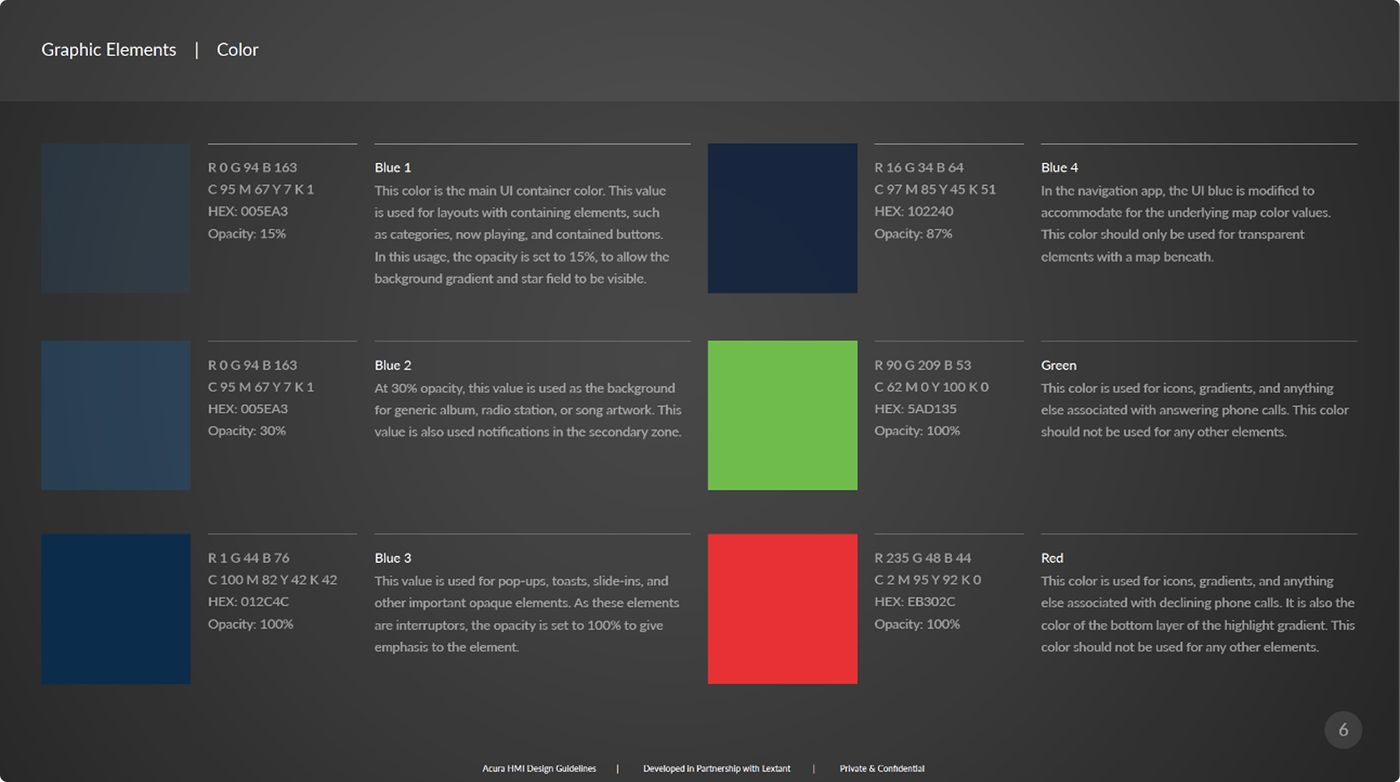
User feedback drove every component — page, transition, animation and interaction. Acura buyers cared deeply about color, so we explored a full spectrum before narrowing to a single production palette: warm, cool, and neutral variants of a direction we called Solstice.
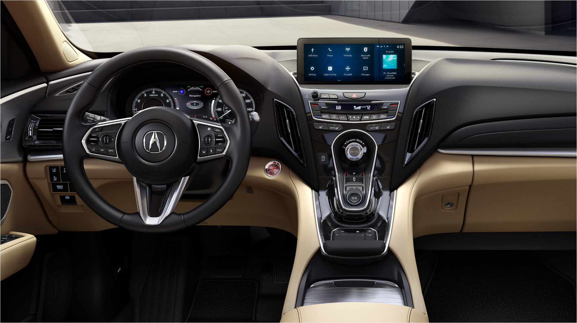
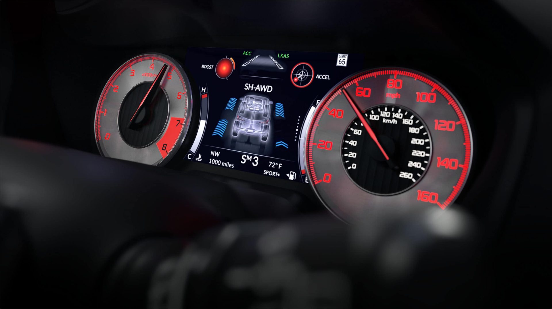
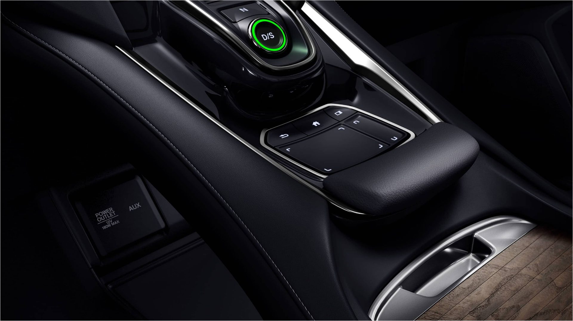
The shipped interface
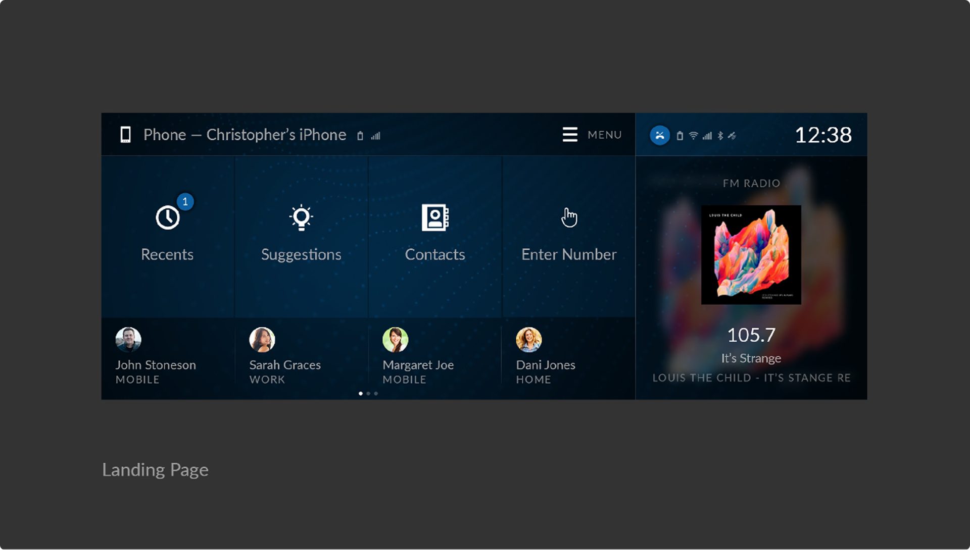
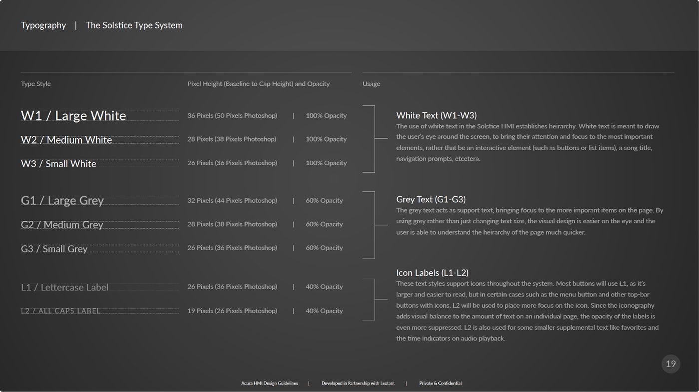
Every screen had to be readable in a glance at speed — large targets, high contrast, and a fixed spatial grammar so a driver never had to hunt.
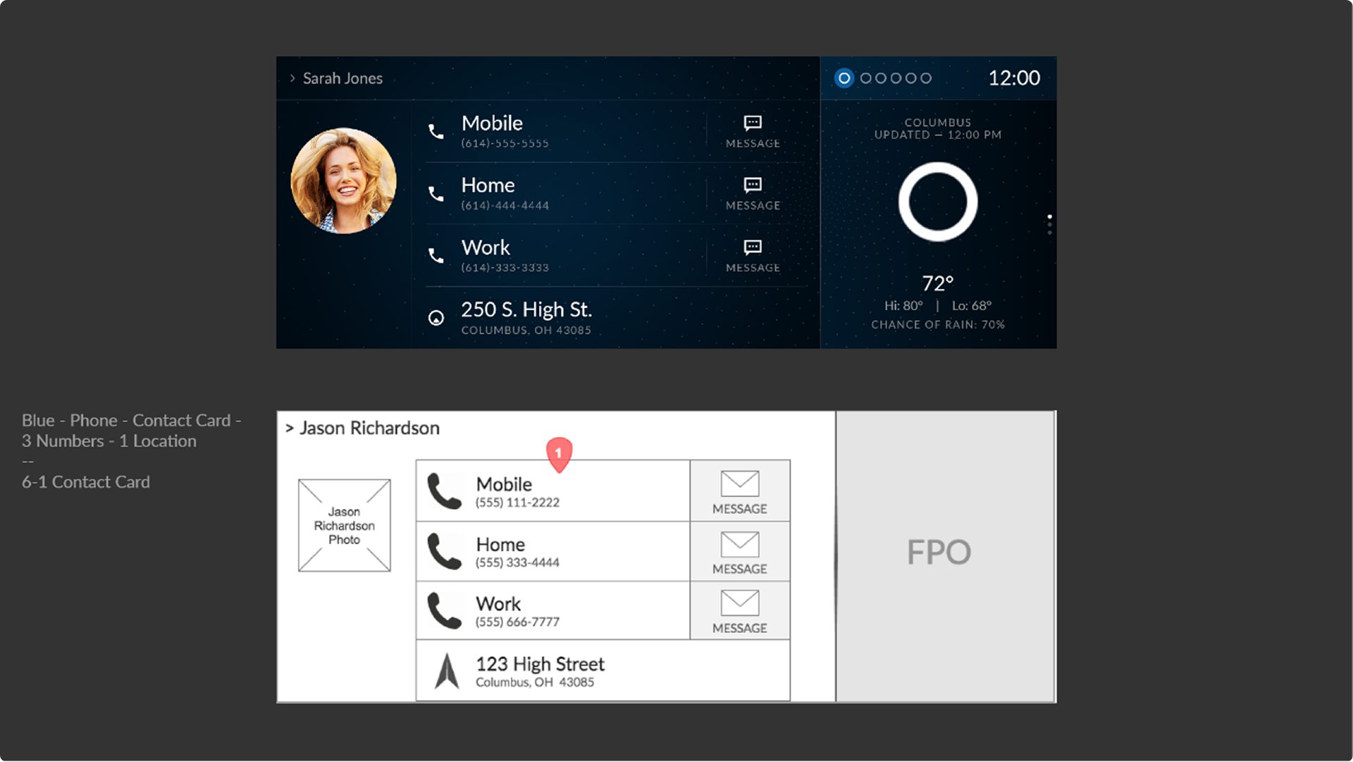
UI specifications
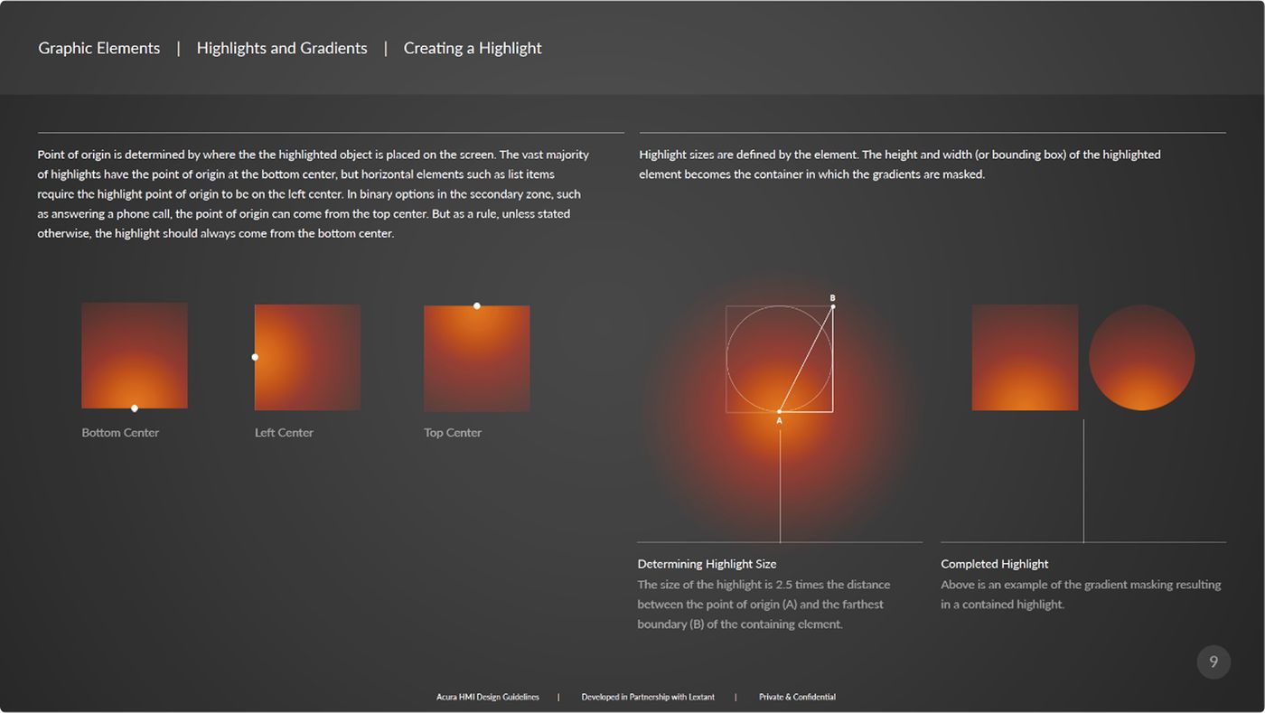
Specs shipped with rationale, not just redlines — so in-house teams could extend the system without us. Click any sheet to enlarge.
Final words
Three years on one system taught me that shipping something durable matters more than shipping something clever. We were designing for a driver at 70 miles an hour, inside an organization spanning two continents and a dozen disciplines, and every decision had to survive both. The reward is that the foundation we set is still being built on a decade later, across Honda and Acura alike — and that the interface went from the thing reviewers apologized for to the thing they led with.