Turning undeliverable packages into deliverable ones
The Address Management System (AMS)
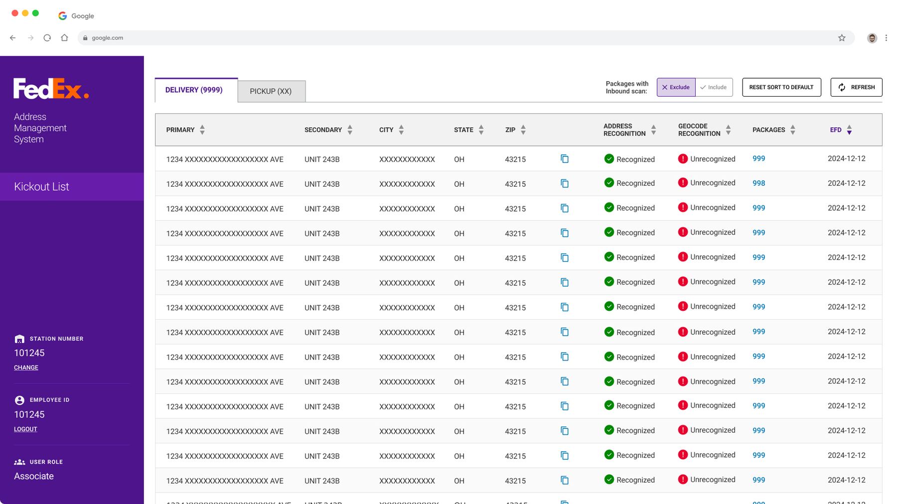
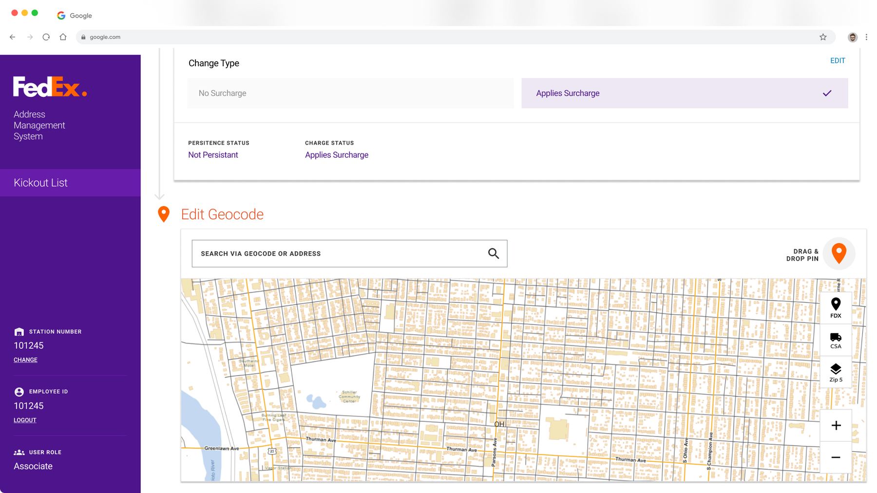
AMS helps FedEx associates fix a package's textual address or map location so it meets the validity requirements of FedEx's routing systems before it reaches final sortation.
Grounded in real associate interviews
I began by interviewing FedEx employees who used the tool, trained others on it, and built and maintained it — surfacing key insights, common pain points, and areas of opportunity.
The goals
These goals came directly out of the discovery process, and every concept that followed was built to meet them.
One continuous flow
Making changes to a package needed to be one continuous flow, so users wouldn't have to search for functions or information.
Teach users how to use it
The tool had to teach users what to do and how their actions affected packages — uniform training couldn't be relied on.
Laymen's terms
The tool needed to be designed in laymen's terms and not require users to have vast technical or operational knowledge to use it effectively.
Focus on content, not operations
Users needed to focus on making the right textual and map changes, not worry about what needed to happen operationally with that information.
Balance policy with user guidance
The tool needed to maintain operational policy and feature parity while guiding users to the right choices, even without knowing the policy themselves.
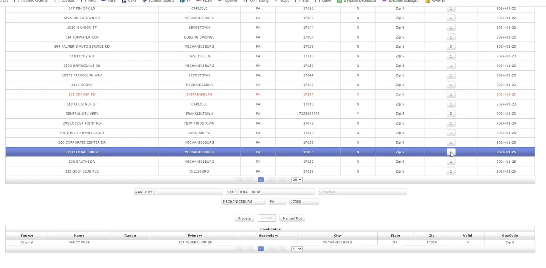
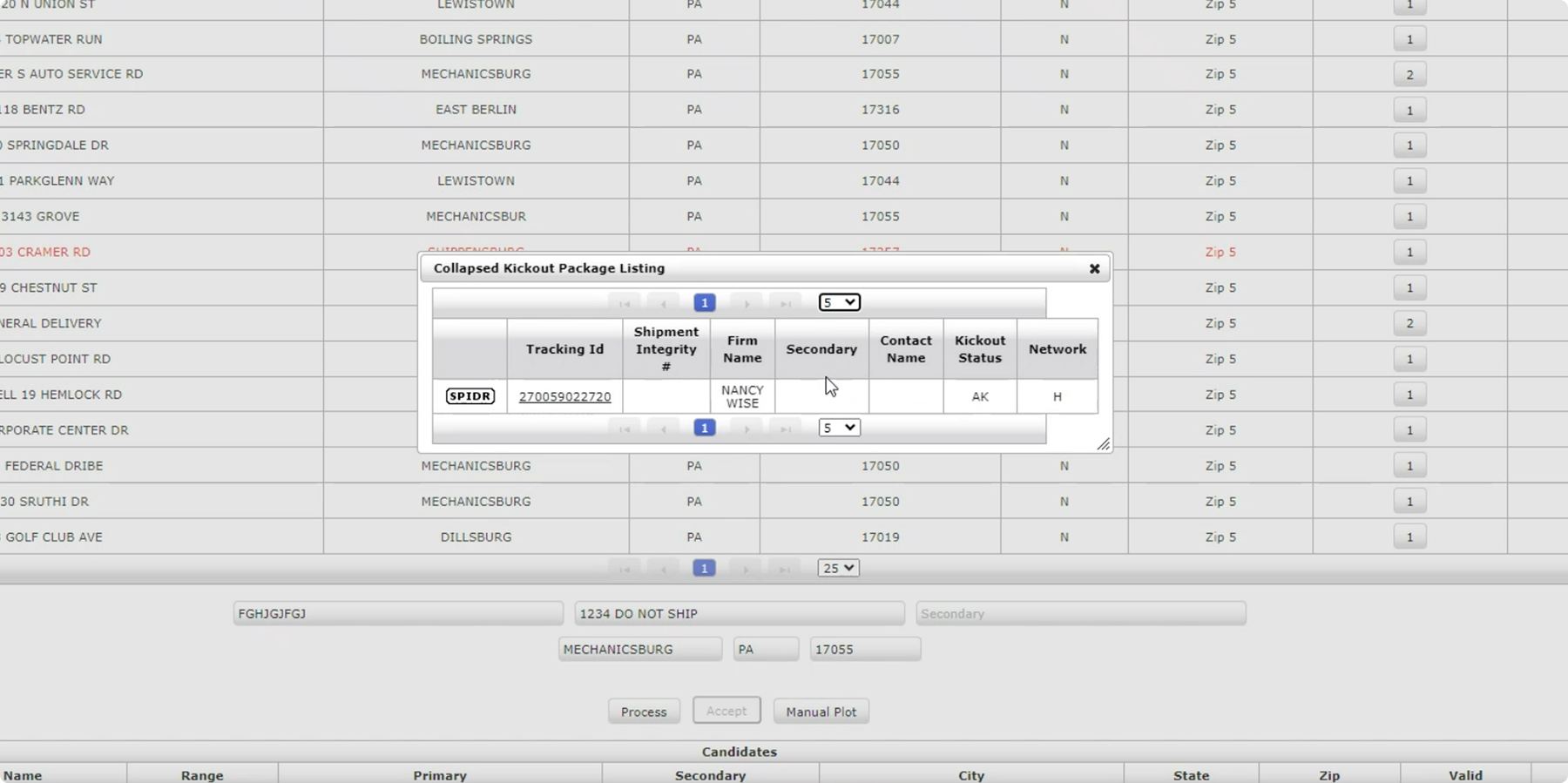
The current tool made simple tasks difficult
Difficult to parse and learn
The current tool is nearly 30 years old. Its UI and interactions are dated, confusing, and ugly.
Functions spread across the tool
Completing basic, repetitive tasks required extra steps and specialized know-how.
Unclear paths
Users didn't always know where to go or what to do, since functions weren't intuitive.
Over-reliance on a single function
Users defaulted to using one function to handle every package, even when it wasn't the right one.
Inconsistent training
Training on the tool was sparse and inconsistent across teams.
Testing early concepts with real users
I created an interactive conceptual prototype to test hypotheses developed during discovery, and led the concept evaluation study across two sortation stations — 8 participants, ranging in age, gender, education, and work experience, were included.
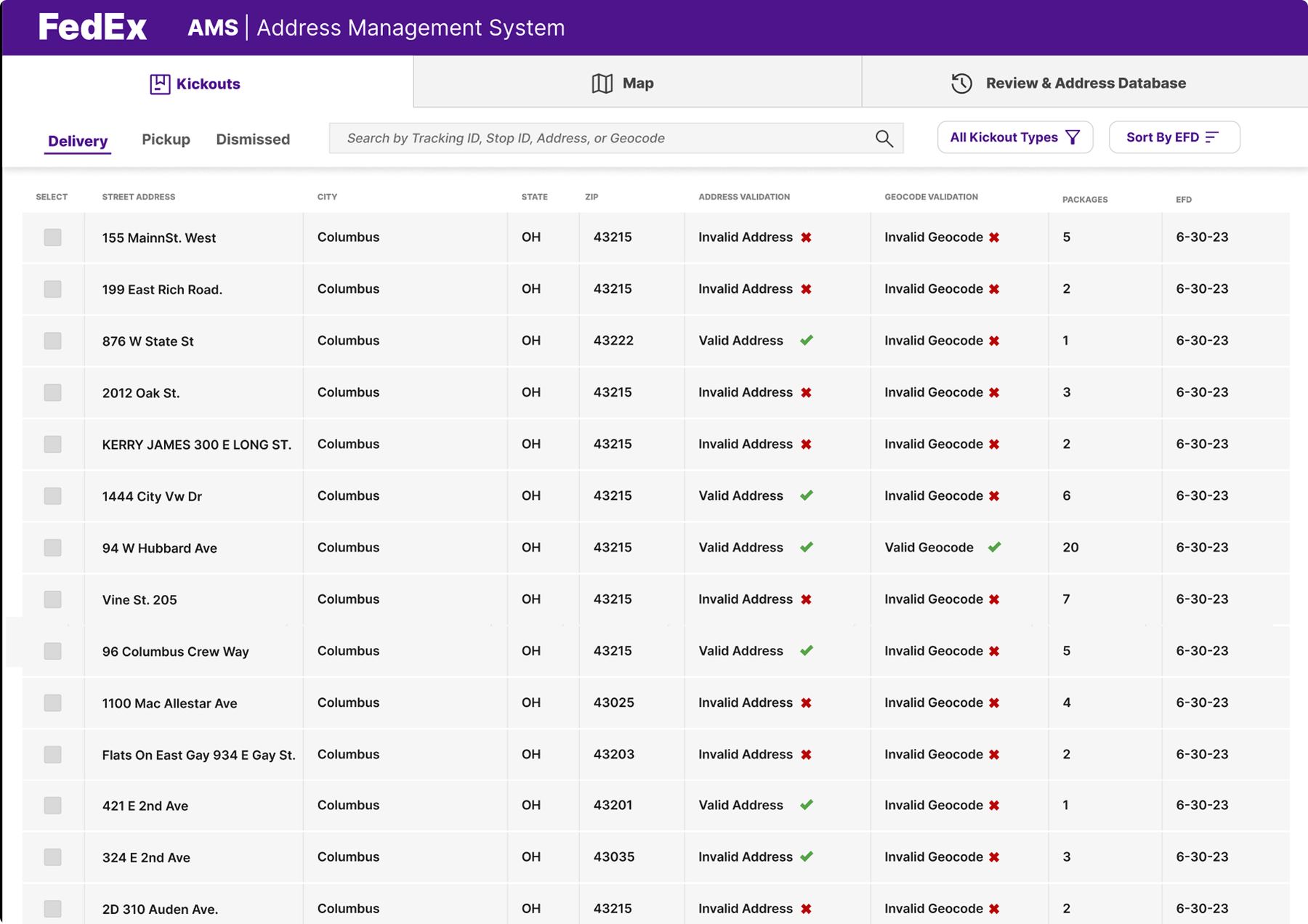
Users select a package record that can't be delivered with the current address or map information.
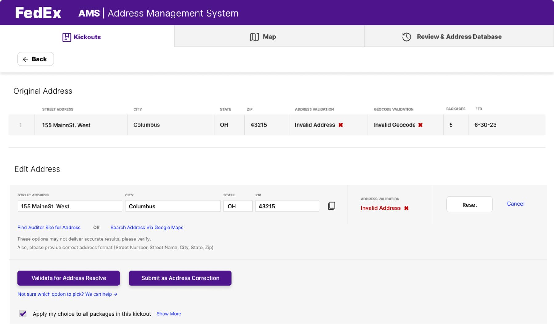
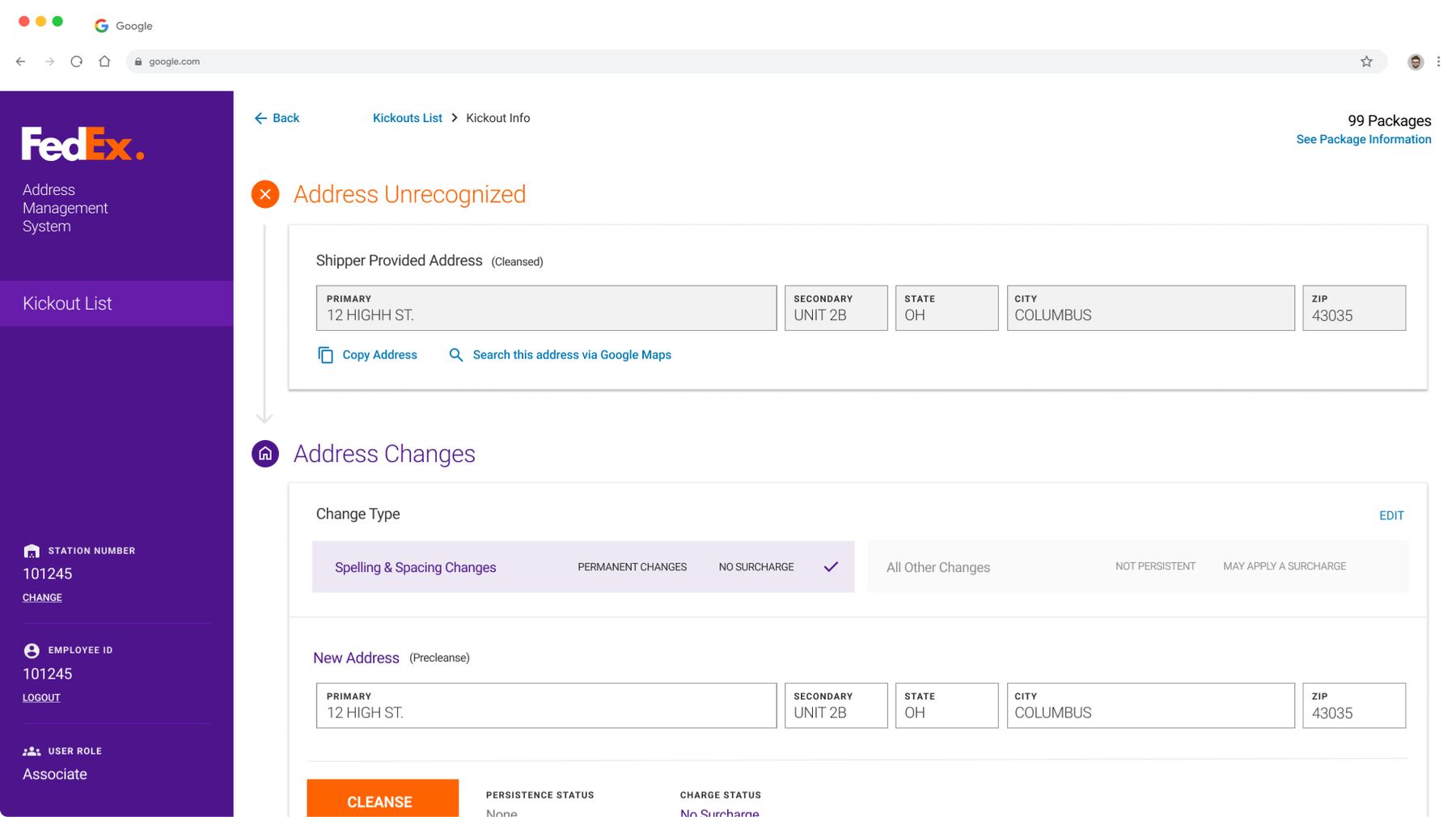
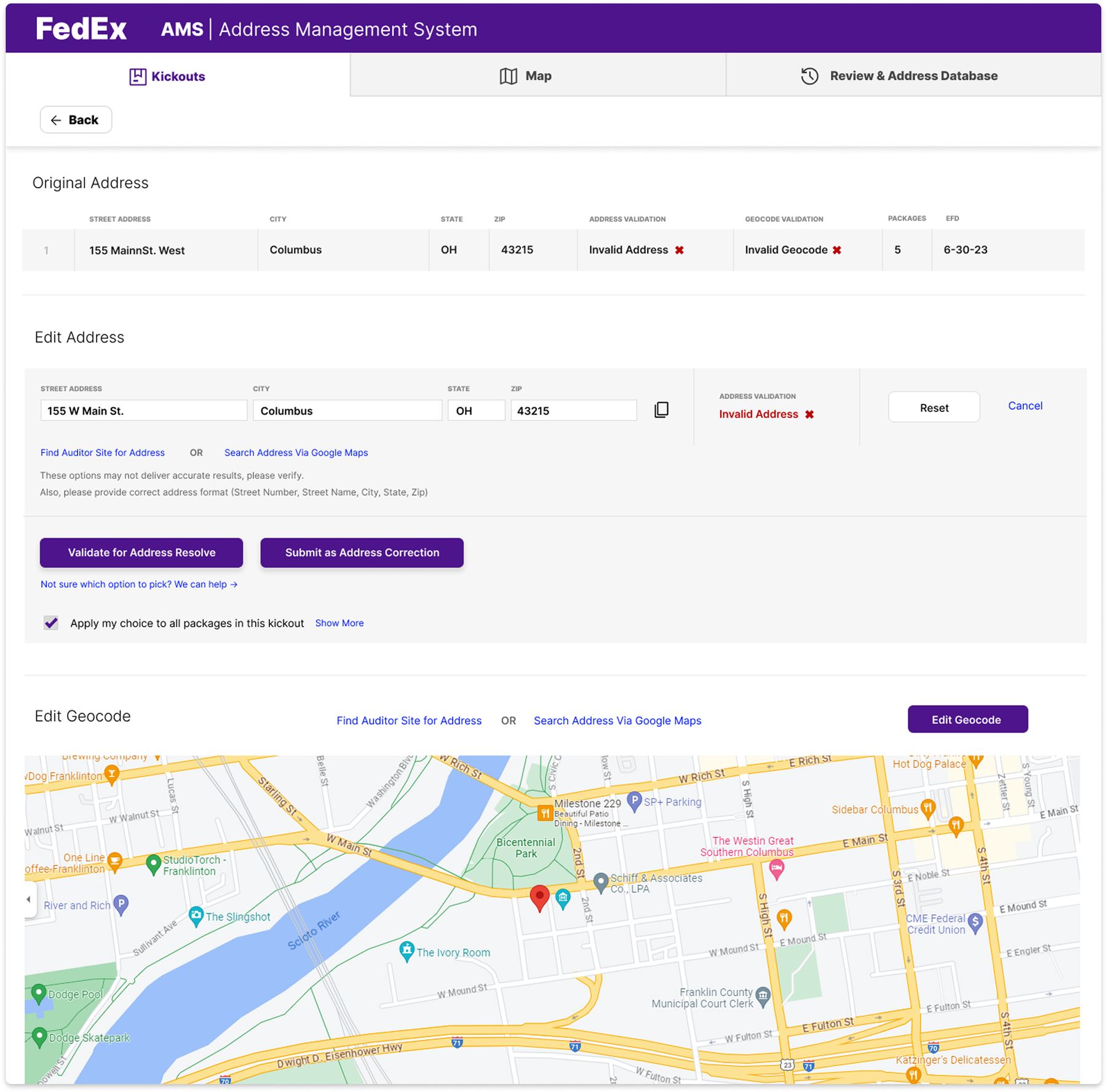
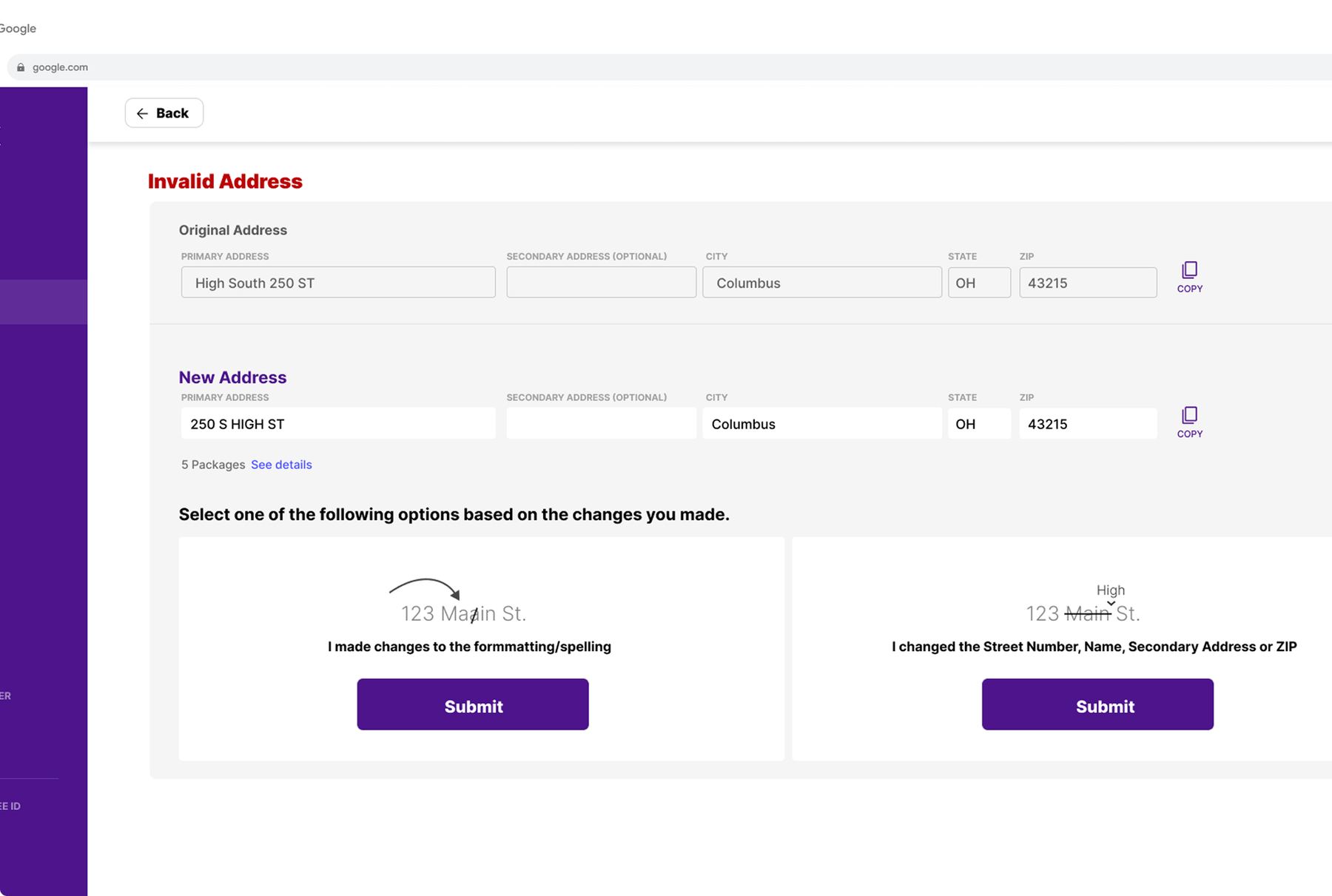
Users make changes to the address — either updating the database to recognize the address information, or changing the address listed on the package.
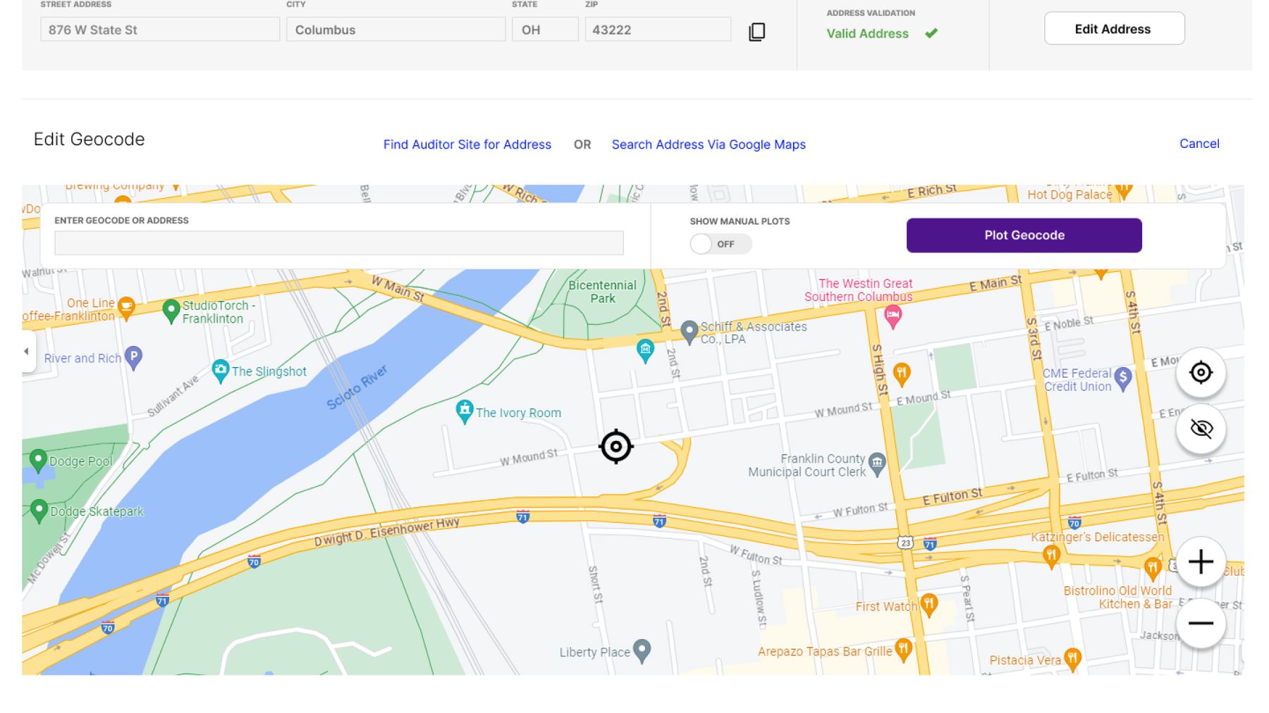
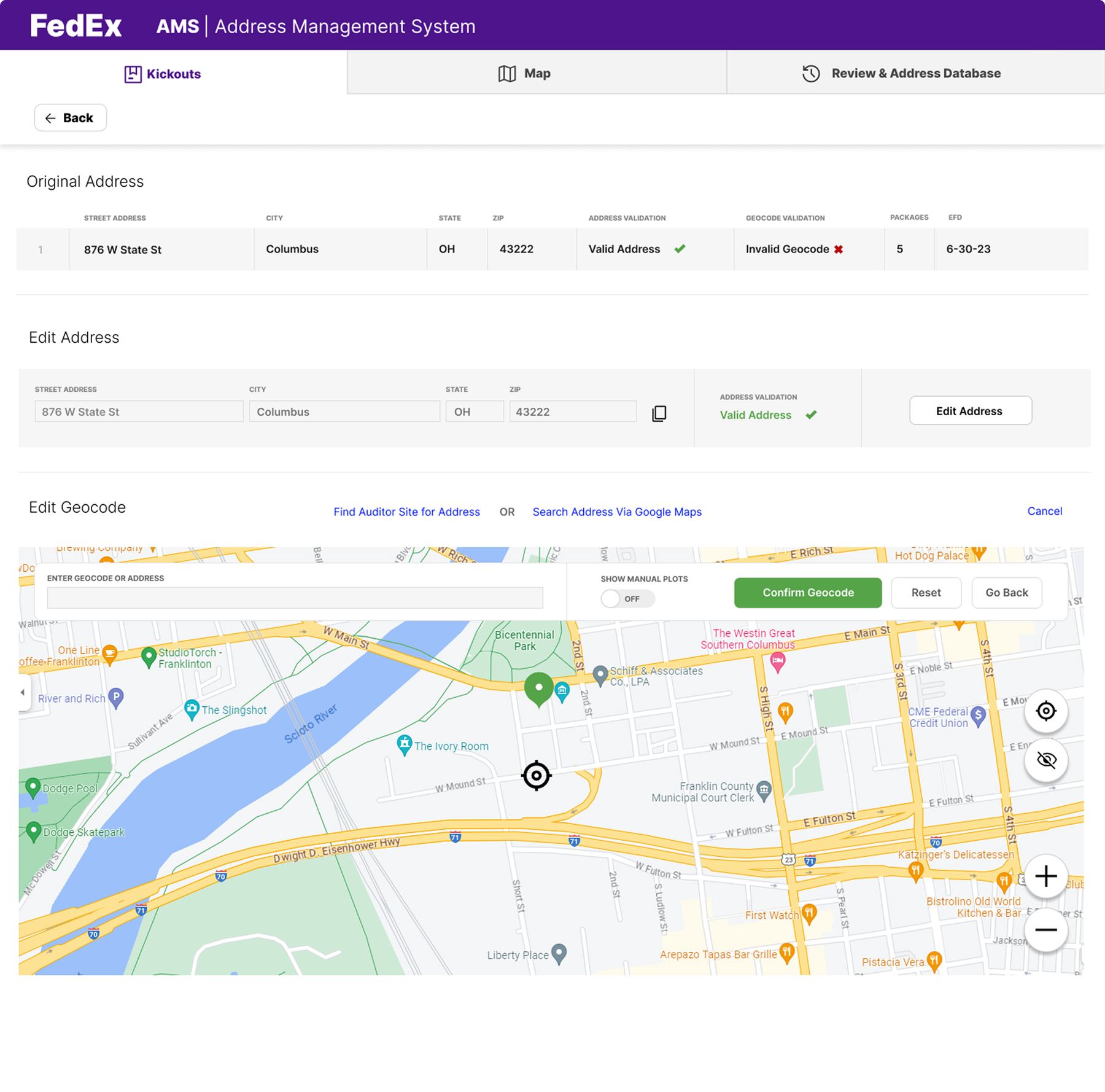
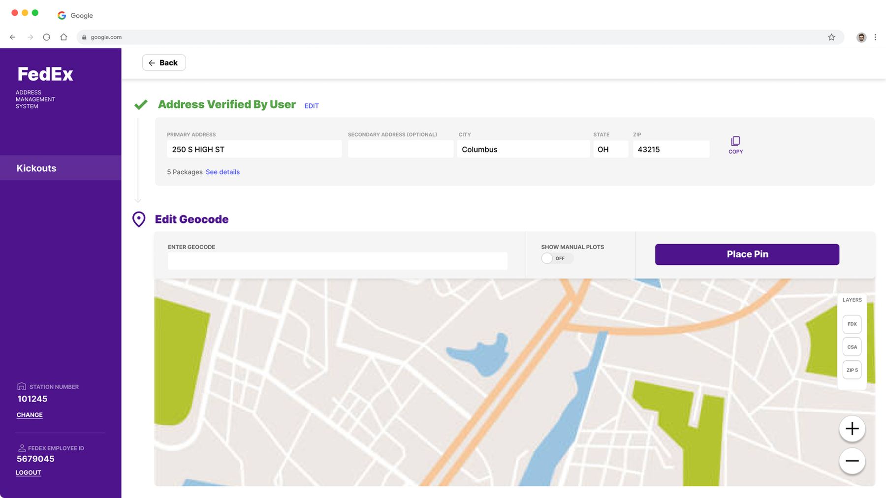
If the system can't recognize the intended address, users can manually plot it on a map.
Future state
The new version needed to reach feature parity. We broke major features out into phases, which made each one more feasible to design and develop.
Each phase went through multiple iterations — from wireframe, to prototype, to final UI — with product, business stakeholders, and users all providing feedback along the way. The goal: take a complicated process and turn it into a seamless, guided experience.
Impact
Scope started as a UI update, then grew to solve issues that weren't part of the original plan. The new concept was far more effective and easier for associates to learn and use. The redesign is expected to meaningfully cut package defects and wasted work while increasing delivery volume.
Phasing a complex rebuild
Rewrite roadmap
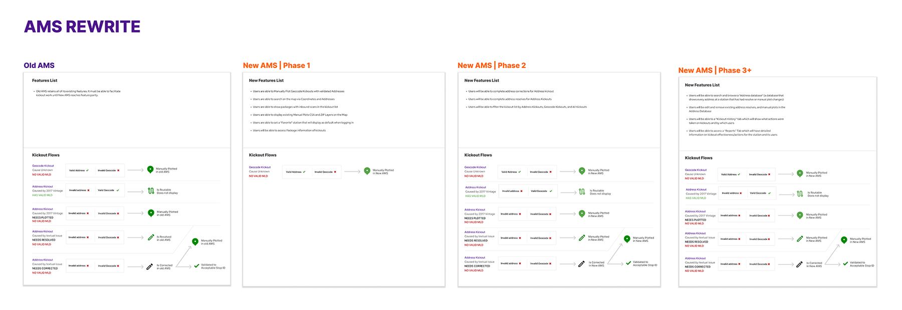
Major features were broken into phases, from the existing system through three planned releases.
Decision tree
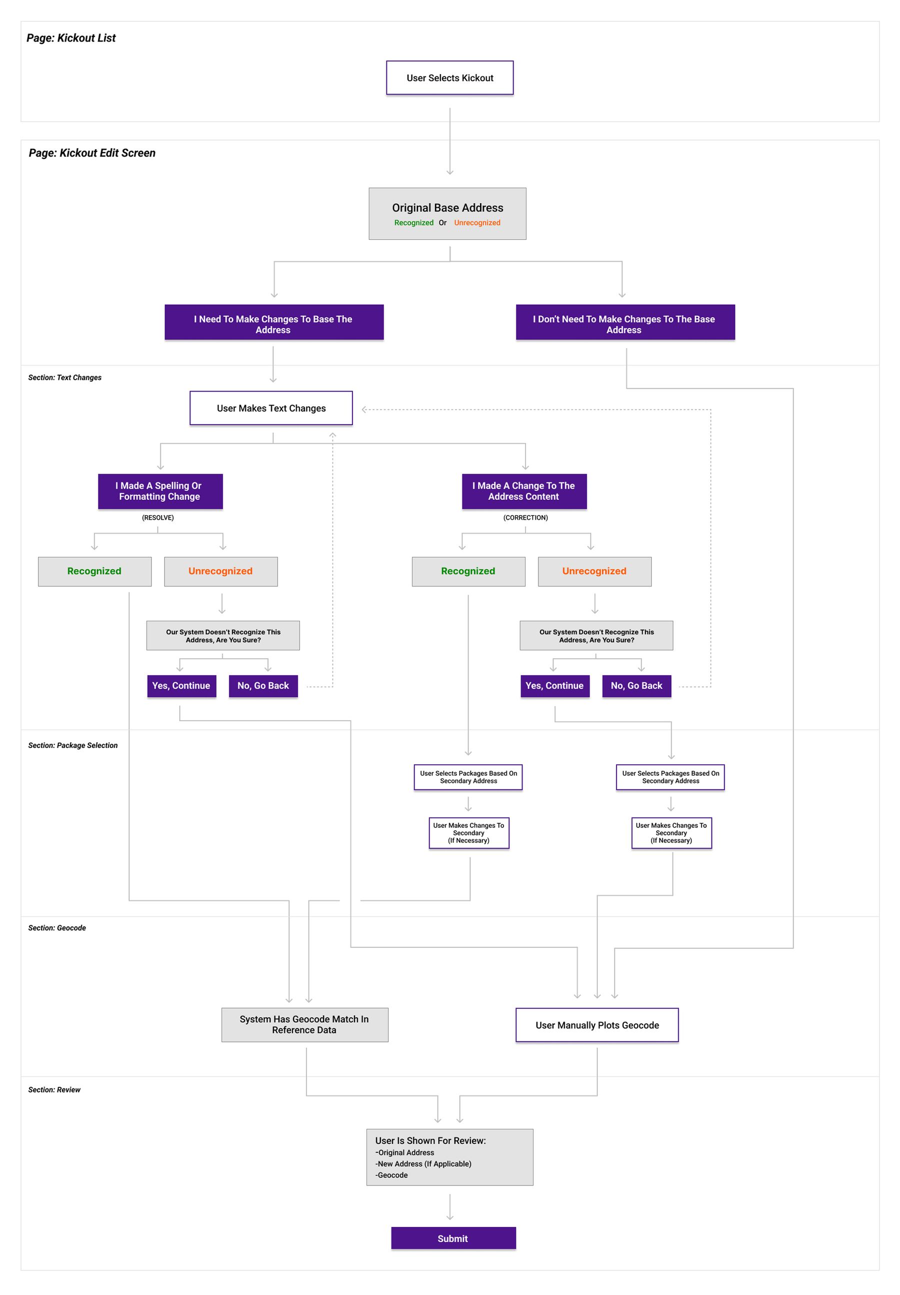
We needed to understand all the possible choices a user would need to make, so we created an accurate decision tree to aid the wireframing and prototyping process.
Iterative design
The design was developed and evaluated as an interactive prototype concept. As we understood the tool's complexities in more detail, the prototype evolved. Users were involved directly in the design process, through feedback and review sessions, and a final UI was created for business review and as a reference for development.
Package selection
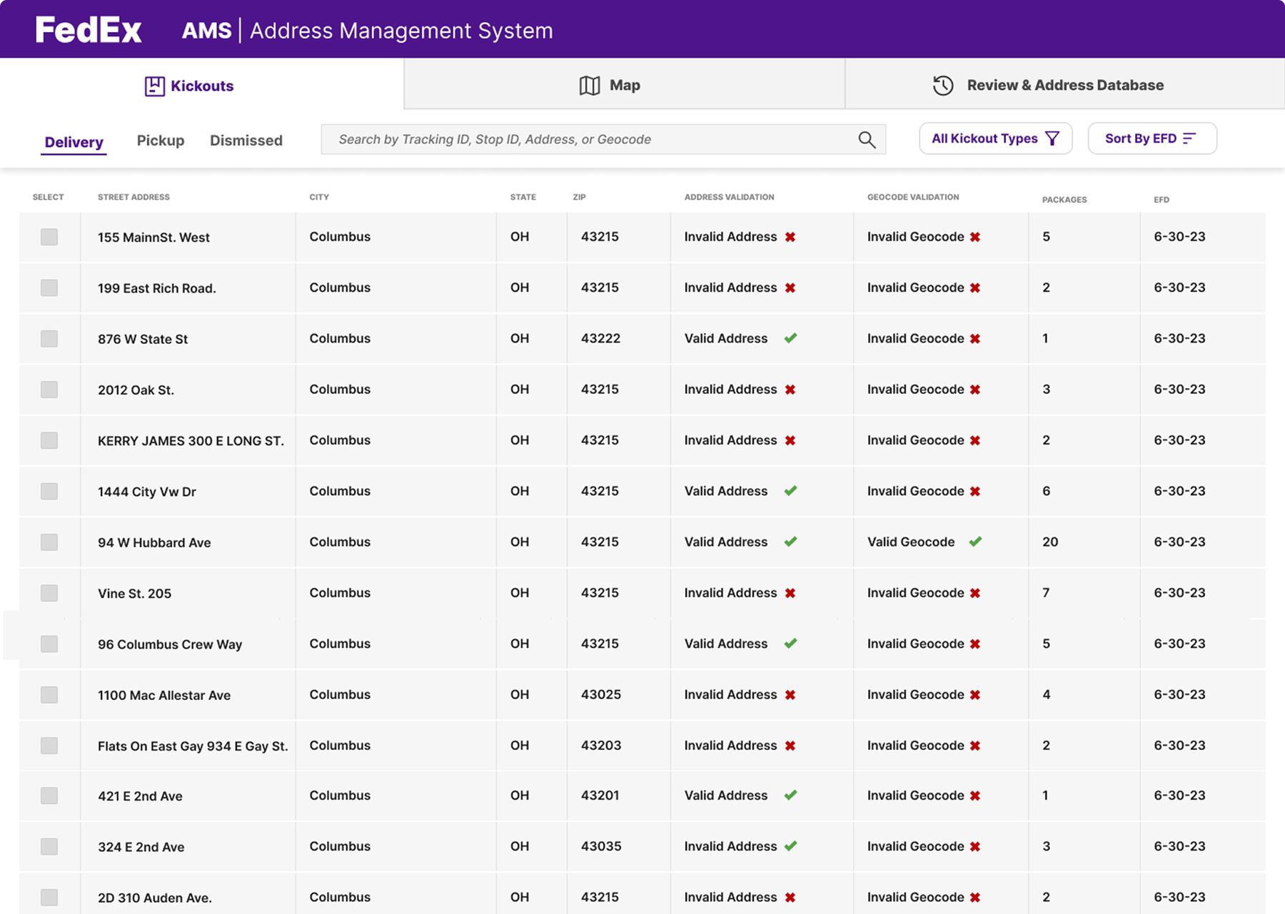
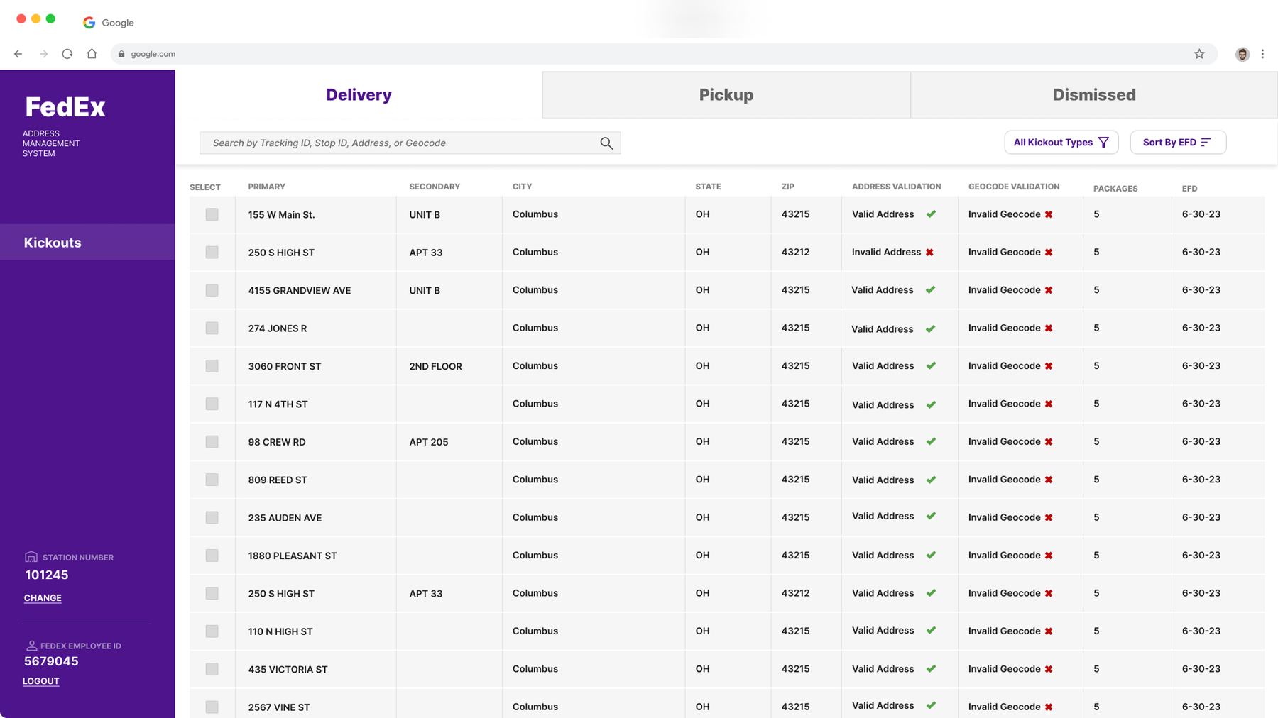
Address editing
Map plotting
Final words
This project reimagined a nearly 30-year-old tool as a guided, associate-first experience. By grounding every phase in real interviews and usability testing, we turned a confusing, function-scattered system into one continuous flow — built to scale across tens of millions of packages a year.